FiveStars Brand Refresh
One of the most exciting projects I've worked on at FiveStars is our brand refresh. A collaborative effort between design and marketing, the refresh kicked off in December 2015 and is still evolving today.
DISCOVER
In December of 2015, I sat down with two of our designers, one of our product marketers, and our VP of Marketing to discuss our current brand. We wanted to fix the bad, continue the good, and make a roadmap for brand over the coming year. Digging into the current brand, we uncovered three core problems:
Lack of brand recognition
Consumers (and business owners) had almost no concept of FiveStars. Both our unaided and aided recall numbers were low, leading to limited organic mobile downloads, a poor number of leads, and more difficult cold sales.
Lack of visual brand identity
For the consumers that could recall the FiveStars name, nothing stood out to them visually about the brand. The products were bland, designed to be easy to sell and to not offend any one type of business owner. This meant they had lost any kind of unique identifier or anything that made them recognizable as FiveStars.
Mismatched brand identity
Finally, the name and the visuals didn't reflect how internal employees and stakeholders felt about FiveStars. The heavy use of black throughout the visual language made the brand feel elite, exclusive, and cold while employees thought of FiveStars as bright, dedicated, caring, and approachable.
DEFINE
While the name wasn't up for discussion, we decided to start fresh on brand positioning and visual direction. Working with marketing, we created internal and external surveys to identify key brand attributes that resonated with consumers, business owners, and employees:
BRIGHT / HELPFUL / FUN
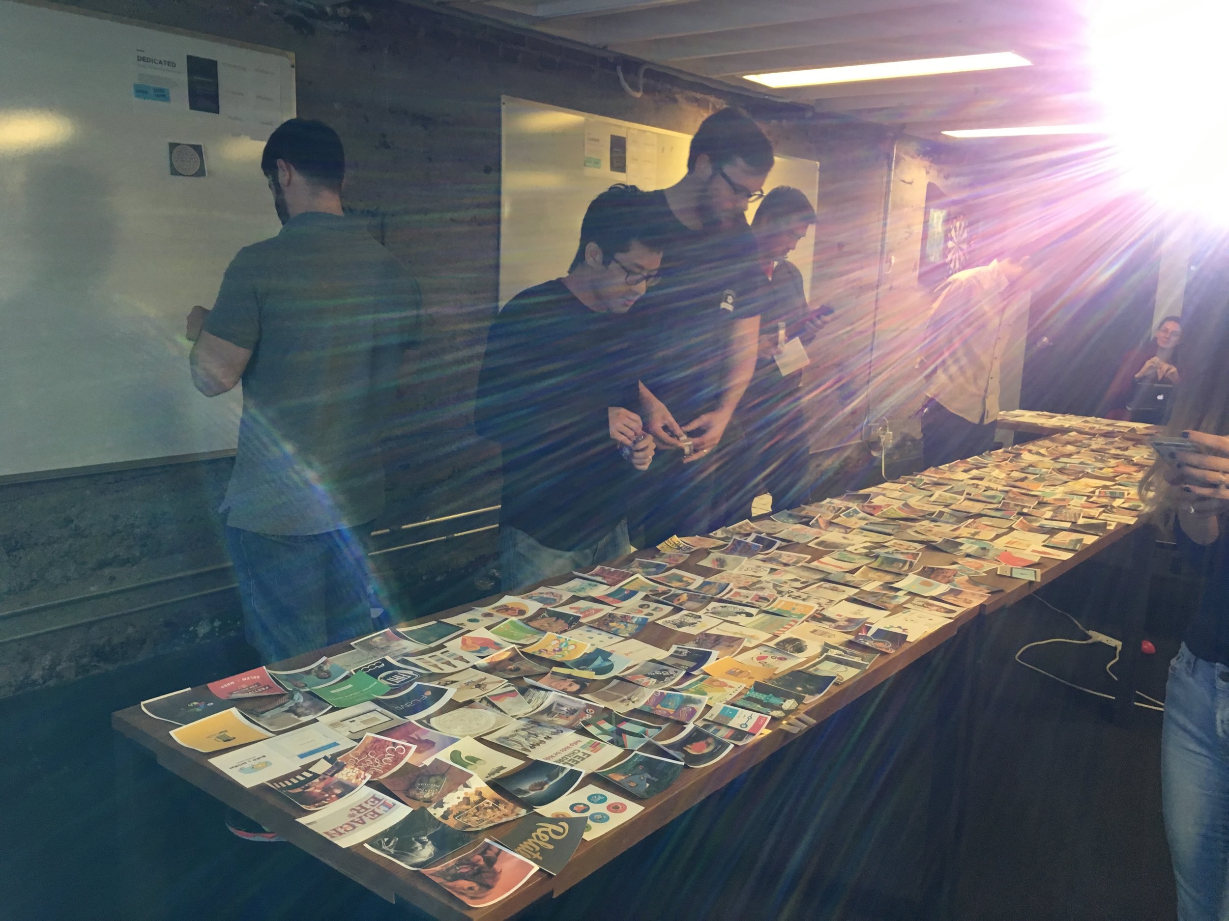
From there, our marketing team took a deep dive on positioning while design pushed forward on visuals. I led a brand workshop with our two designers and our executive team. The team identified pieces of visual inspiration that they felt represented FiveStars and aligned with the new brand attributes we had created. From the visuals chosen we created inspiration boards, working through high level language pieces like color, transparency, shape, illustration, etc. We wanted to be sure that any direction we chose could scale appropriately - across channels, platforms, digital and physical products, etc. I also took point on ensuring that our visual work aligned with the brand positioning the marketing team was working on, reinforcing our brand values in everything we were creating.
DESIGN
Once we narrowed down to a single brand positioning and a single visual direction we blew out detailed designs. Everything had to be considered - app icons, tablet screens, phone screens, POS integrations, t-shirts, business cards, table tents, window decals, packaging... the list goes on. We hired an outside firm to detail all the pieces while our internal designers stayed focused on our products and bringing small touches to each that kept them aligned with the new direction we were headed. Our key focus was on creating ownable moments that were uniquely FiveStars.
We ran into a couple snags along the way. One in particular was our logo mark. It became clear that the current mark wasn't resonating with our new brand positioning. We looked externally for someone who could focus all of their attention on the mark and hired a fantastic firm to brainstorm, iterate on, and polish a new shape for us. We kept at it for months, working through a variety of options, even putting more internal minds against it. At the end of the day, however, the legacy and history of our existing mark was too much for our executive team to move away from, and we chose to table the work.
DOCUMENT & DELIVER
So, where did we land today? That story is still being written. The brand is always evolving and that new logo mark? It might still make an appearance one day. In the mean time, we've gotten to an updated brand language that resonates with our employees, is identifiable by our consumers, and brings our business owners confidence in our brand and in our company.
I've been guiding one of our visual designers in creating new brand guidelines. It's one of the biggest projects he's taken on and it's helping him flex new muscles. I'm working with our product designers to create a unified set of brand elements that can be used on any of our products, whether physical or digital, and are easily accessible for engineers, third parties, etc.
We launched our new website in February 2017, showing off our new positioning and our new visual language. Our recent mobile app for business owners continues to push the boundaries of our brand and our other products are making their way to the finish line as well. Keep your eyes open for the exciting changes coming through the end of the year!


